COLOR & INSPIRATION
Lavender Field
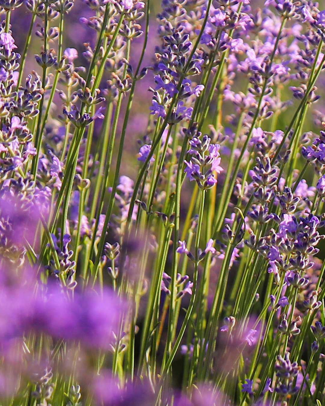
Lavender Field 🌿💜
Soft purple blossoms rising through slender green stems create a palette that feels natural, fragrant, and quietly luminous.
The scene is full of movement and texture, but the colors remain surprisingly balanced — dusty mauve, deep olive, lavender violet, muted green, and fresh yellow-green all working together without competing for attention.
The mauve tone brings a calm, earthy softness, while the lavender captures the delicate character of the flowers in sunlight. Deep olive adds contrast and structure through the stems and shadows, and the two green tones introduce a more vibrant botanical energy. Together, the palette feels organic, slightly rustic, and gently romantic rather than overly sweet.
This combination works especially well for botanical branding, natural cosmetics, wellness concepts, packaging, stationery, editorial layouts, home décor, and seasonal visuals that need a soft floral identity grounded by earthy greens.
#8E706F · #504E2E · #AF71AF · #6F6F31 · #8B8C34
A field of flowers is never just one color. Look between the petals, stems, shadows, and light, and you will find an entire palette waiting to be discovered. Turn those natural moments into your own color story with Paletile.