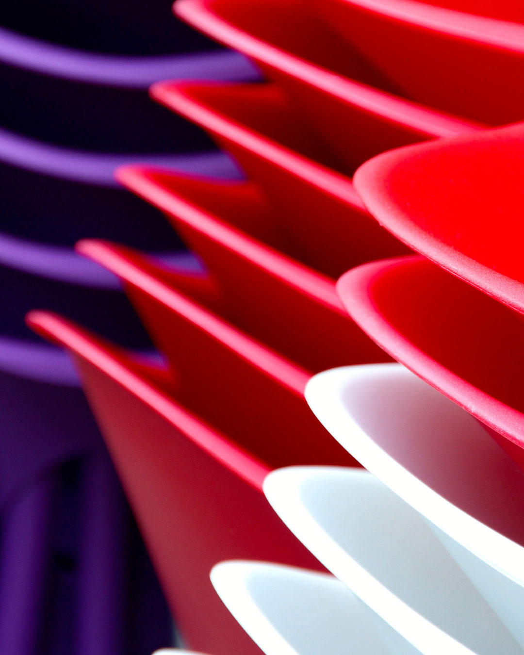
Neon Red Rhythm
Bold curves, glowing edges, and deep shadow create a palette with strong visual impact.
Read storyTHE PALETILE JOURNAL
Color stories, creative inspiration and practical guides for your next design project.
Bold curves, glowing edges, and deep shadow create a palette with strong visual impact.
Read story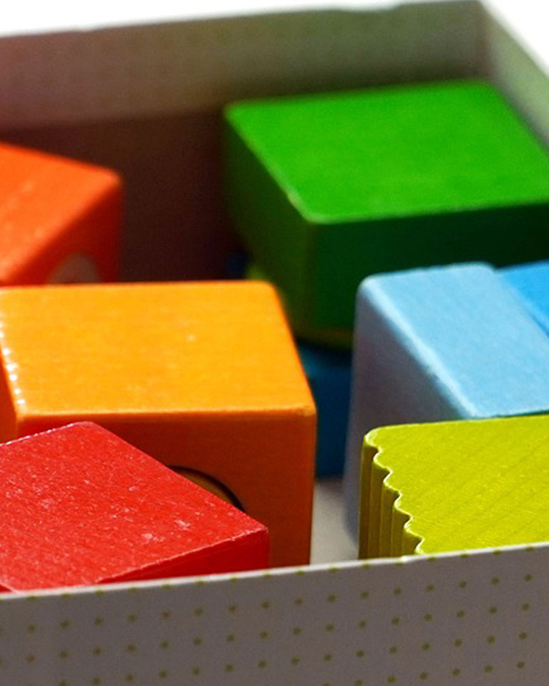
This palette comes from a set of colorful blocks, where orange, red, green, and yellow-green sit side by side against a softer neutral brown. The result feels energetic and graphic, with a strong sense of movement and visual rhythm.
Read story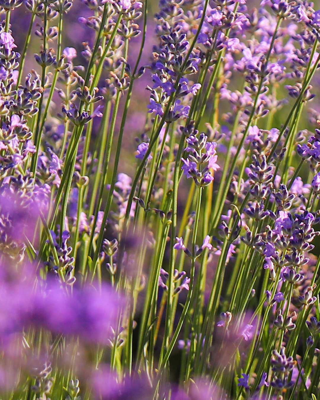
Soft purple blossoms rising through slender green stems create a palette that feels natural, fragrant, and quietly luminous.
Read story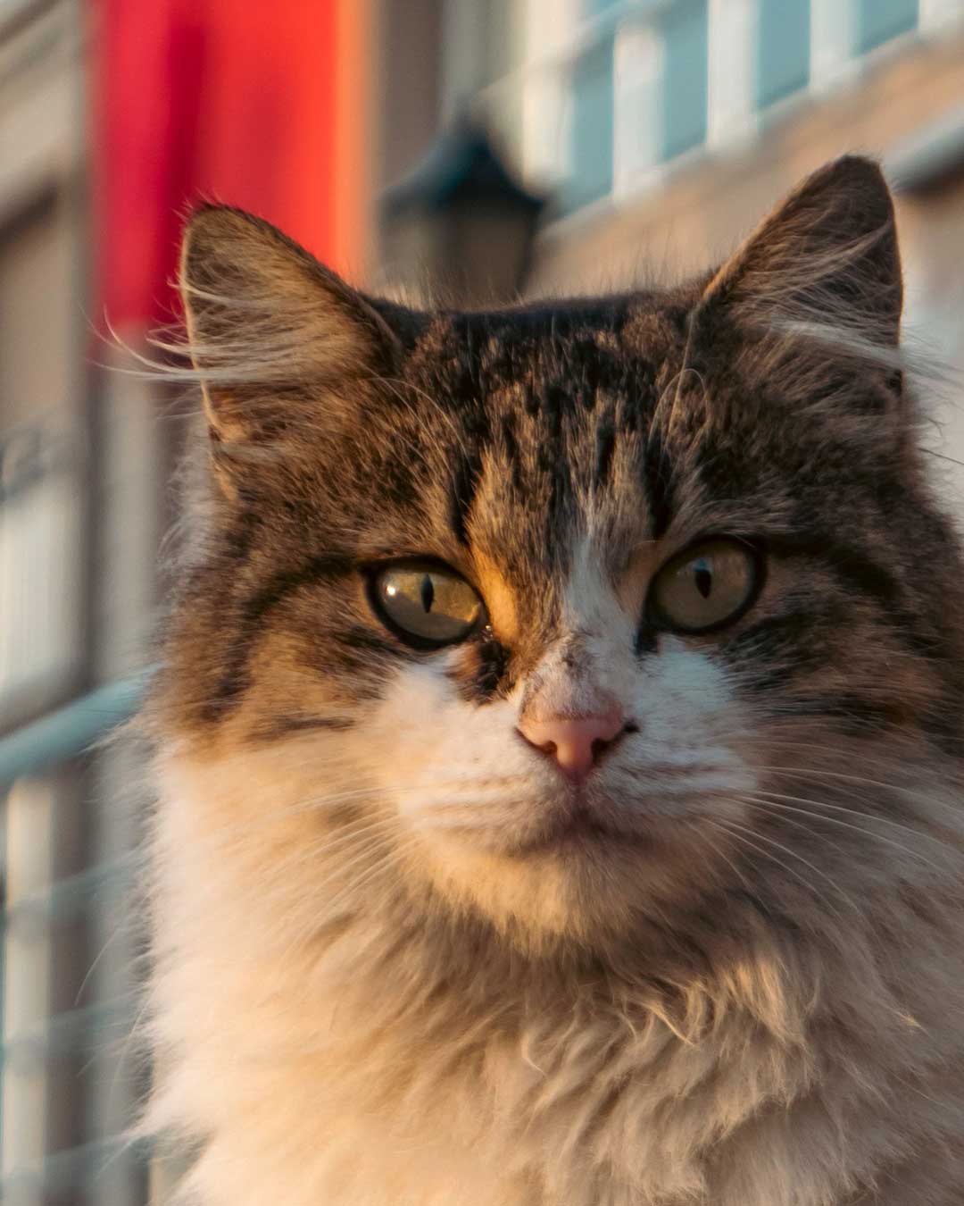
Warm sunlight, soft fur, and a quiet gaze. This palette is inspired by the natural browns, creams, and deep shadows of a cat resting in late-afternoon light, where every strand of fur picks up a slightly different tone.
Read story
Rich in detail, tradition, and layered color. This palette is drawn from an intricately decorated guardian figure, where painted ornament, carved structure, fabric, and shadow come together in a dense but balanced composition.
Read story
Cool, immersive, and quietly dramatic. This palette comes from the layered blues of a close-up orchid, where soft petals shift from pale sky blue into saturated cobalt, deep indigo, and almost-black navy.
Read story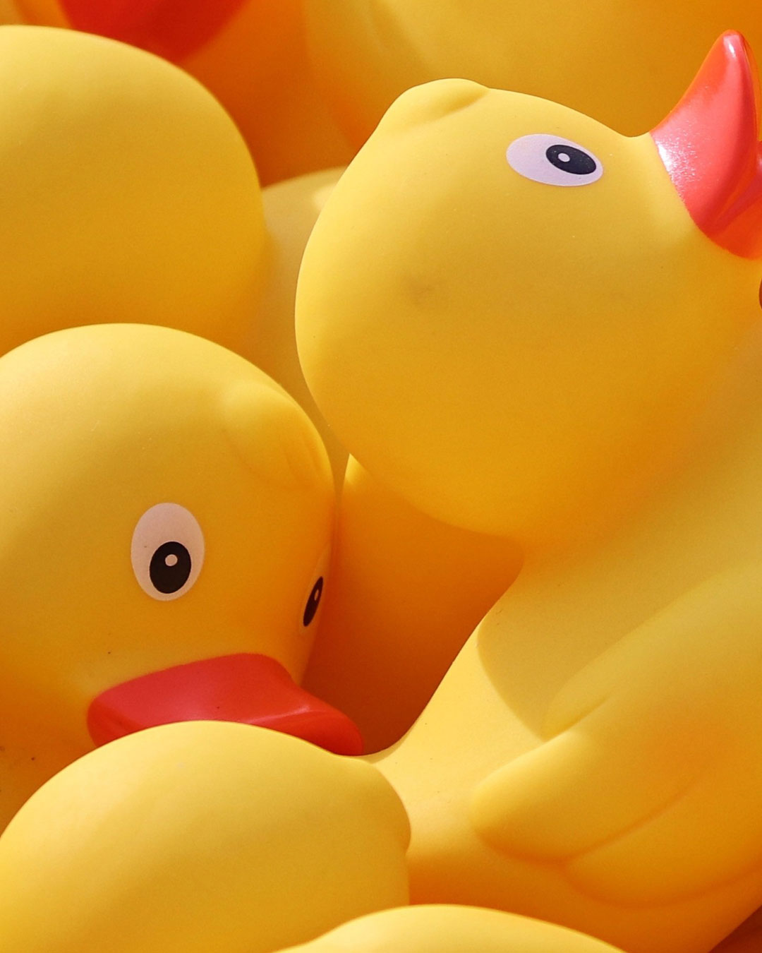
Bright, playful, and full of energy. This palette comes from the cheerful yellow of rubber ducks, warmed by golden orange shadows and accented with vivid red-orange details. The result feels instantly optimistic — a mix of sunshine, playfulness, and bold color contrast.
Read story
Bold, mechanical, and impossible to ignore. This palette was inspired by the vivid red body of a vintage-style machine, where polished metal, deep shadows, and a surprising touch of mint green create a strong visual contrast.
Read story
A quiet study in soft neutrals, drawn from the subtle tones of a seagull and the weathered concrete behind it.
Read story
A quiet composition built from warm amber, cool lavender, and soft neutral shadows. The photograph feels intimate and slightly nostalgic, with the rich brown of the bottle creating warmth while the pale blue-violet label introduces a calm contrast that immediately catches the eye.
Read story
A quiet spring moment where time seems to slow down. Surrounded by soft cherry blossoms, deep greens, and the muted stillness of an overcast day, this scene turns an ordinary walkway and a simple clock into something calm, nostalgic, and quietly beautiful.
Read story
A moment where structure meets sky. This palette was drawn from the clean geometry of a suspension bridge standing beneath heavy clouds, with a small break of blue opening through the overcast sky.
Read story